All Posts

To see all flags published, click here.
Showing posts with label Other proposal. Show all posts

Feb 28, 2013

New York

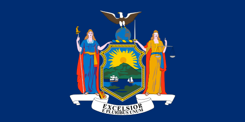
New York is a standard American state flag, what means it's below the average:


[Current flag]
The NY state flag had a buff background, what made it almost identical to its neighbor New Jersey. So, in 1901, the background color was changed to blue, and then it became identical to all the others! Yeah, it wasn't a good idea, if you look in retrospect...

But I think New York don't need a downgrade, but a upgrade, and a really thought one to don't regret anymore. For all the NY flag proposals I ever saw, my favorite was made by Jack Expo:


[Proposed flag - Design by Jack Expo]
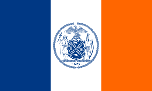
The colors orange, white and blue came from the Dutch national colors, representing the Dutch heritage, on the time New York region was still name New Netherlands and New York city was still the New Amsterdam. The same Dutch heritage is honored in the current flags of New York City and Albany. The general layout of the flag (specially the blue part) represents the Erie Canal crossing the state. The Erie Canal is one of the few NY symbols that divides and unites the whole state.

Comments are welcome!

Jan 20, 2013

DC and Washington

Washington D.C. and Washington state both took their name from George Washington. How much their flag should look like? Firstly, look at District of Columbia flag:


[Current flag - Design by Charles A.R. Dunn]
This flag I won't change. It's represents the DC incredibly well, and has a very thought origin: it's a rectangular version of the coat of arms (i.e. a banner of arms) of the family of George Washington, that gives the federal district the name.

Now, let's see Washington flag:


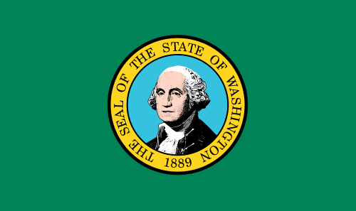
[Current flag]
Like DC flag, Washington state flag pays tribute to the USA independence hero George Washington, but in a very lazier way. As nobody wants Washington's face badly conceived on a flag, I think we should work it out. The easiest way to do it is mix Washington arms with state colors, like in these flag by grendelsbayne (very similar to one by Andrew Rogers):


[Proposed flag - Design by grendelsbayne]
This design is outstanding, and could do an excellent Washington flag, but I think I can do something by myself.


[My proposed flag]
A new arrangement, remarkable but still related to Washington arms.

Your comment is welcome!

Jan 5, 2013

Michigan and Minnesota

Some good initiatives started in internet, two of them I cited in Utah and Vermont pages. Today I'll show other two I like too much, one for Minnesota and one for Michigan. First, let's see Minnesota current flag:


[Current flag]
Well, I think it's one of worst American state flags. You can't understand everything's going on at first sight, and it's virtually impossible of being hand-drawn. And, if you tried, how many colors would you use? Seriously, only count the colors is difficult. Fortunately, there's a group of people called "North Star Flag" that are gaining some success:


[Proposed flag - Design by Rev. William Becker and Lee Herold]
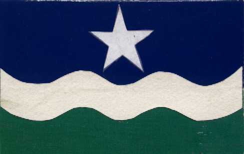
Now you can draw and count the colors easily, can't you? See more about the design at . The symbolism is the following: blue for sky, white for winter, green for land, the start represents the "North Star" (state motto since statehood). Know more here. Curiously, it's very similar to one flag to a flag gained a newspaper-sponsored poll in 2001.

After that, there's Michigan. See current flag:


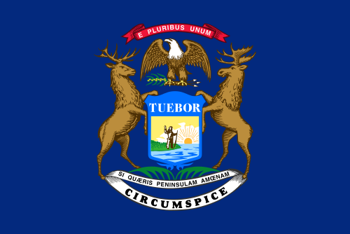
[Current flag]
The elk and the moose are sympathetic animals, but a flag isn't a good place for them. Only a standard generic flag: a coat of arms or seal in a blue background. Christopher Zervic came with a better design:


[Proposed flag - Design by Christopher Zervic]
Excellent flag, with simple and strong symbolism: the green part with two stars represents the two peninsulas that constitute the state; the five horizontal stripes represent the five Great Lakes (only four of them border Michigan, but whatever). You can see, in my other blog, a design I made mixing this and another proposal to Michigan flag:


[My proposed flag]
Comments are welcome! Access the Vexillology Wiki.

Dec 23, 2012

Delaware

Delaware was the first state in the federation. Some day I read somewhere wondering why the thirteen colonies, full of history, have some of worst flags. I would consider Maryland, South Carolina and maybe Rhode Island as exceptions. But, as blog subtitle says, "a good flag is not a privilege".

Let's look at current Delaware flag:


[Current flag]
Of course, this buff-color lozenge makes this flag reasonably dissimilar of others in USA, but this coat of arms and the letters don't make it simple, for sure.

My flag proposal is based on a post by Jack Expo, where he pays attention in a very curious fact about Delaware: it was the only colony founded by the Swedes. With that in mind, I come with this design:


[My flag proposal]
The lozenge was extended and used to frame a centered flag of Sweden flag. The background was changed to buff-color, because two shades of blue should be avoided. This blue and yellow shades are (intended to be) the same of Swedish flag, but the blue could be returned to the colors of George Washington's uniform, whatever historians say it was.

Starting from a very similar design, Jack Expo came with its own design. I highly recommends you to confer his proposal (click here to be redirected).

Comments are welcome!

Dec 18, 2012

Montana and Utah

Let's start showing the current Utah flag:


[Current flag]
Apparently, before 2011, the version used a blue shield with white letters, but historians concluded the opposed is the correct. Another state with a flag consisting in a blue field with a seal in the middle. No more comments!

Utah is a state with deep roots in Mormonism. My idea of flag to the state is based on Deseret flag. Unfortunately, this flag is copyrighted by somebody named John T. Wardle. Poor man, nobody told him he can't copyright a historical flag nor a religious symbol. If you want to know how it looks, go to LDSFlag.com. But, for my fortune, there's a better variant flag, considered the historically correct one (if you believe my source), but apparently non-copyrighted. I'm smart too, Mr. Wardle!


[Historical flag]
The difference between this flag and Mr. Wardle's one is the blue canton with white stars instead of a white canton with blue stars, and the use of thirteen stripes (just like US national flag) instead of twelve stripes, that look worse and has only religious symbolism: twelve Tribes of Israel, twelve apostles, etc.

If civil people protest against using a flag so religion-loaded, I'd suggest the use of beehive (another Mormons symbol, but used in current flag). The following design is, actually, Jack Expo's idea. I only changed the number of stars to thirteen:


[My proposed flag, based on design by Jack Expo]
Just for comparison, look at NAVA (Northern American Vexillological Association) 2002 contest finalists. The most popular of them is the following, that represents state snow-capped mountains and, upside-down, the state seagulls (but who looks at the flag upside-down?).


[Proposed flag - Design by Dustin Eachtel]
I won't use it to Utah because I just chose my favorite, but it inspired me ideas to my Montana flag. But I present the current Montana flag before:


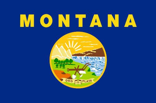
[Current flag]
Montana flag is still worse than Utah flag, in my opinion. Too many complicated details!

For my design, I used the colors of this proposed flag, that's too monochromatic, for me. Fusing this flag with the Eachel's proposal to Utah flag, I came with this design to Montana flag:


[My proposed flag]
Did it took a strange origin? You decides!

Comments are welcome!

Dec 9, 2012

Oregon

The flag of Oregon is unique in US: it's the only with a reverse different from the obverse. Actually, Alabama and Massachusetts also used flags like this, but only Oregonian flag remains. Let's look at both sides of the flag:


[Current flag obverse]


[Current flag reverse]
The design of obverse is poor. The obverse is a lot better, but not ravishing.

To choice my favorite, I consulted a poll conducted by NAVA (North American Vexillological Association) in 2009. If you look the report with finalist entries, probably many flags will attract you. My favorite (that finished in 3rd position) was design by Douglas Lynch, that also created the absolutely amazing Portland flag. See it:


[Proposed flag - Design by Douglas Lynch]
Green for the forests, yellow for desert or wheat, the white triangles being the snow-capped mountains that divides the two parts of the state.

And for you, what is the best design to Oregon? Please, leave a comment.

Nov 23, 2012

Maine and Vermont

In the case of Vermont and Maine, I came with two similar flags, so I had to decide which of the flags should have the design.


[Current flag]
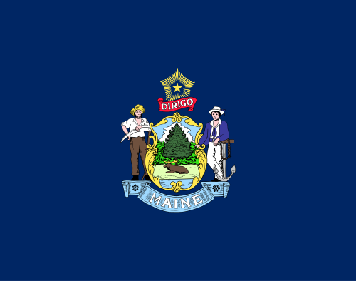
The Maine flag is considered one of worst state flags in USA: it as a complex coat of arms, many writing and its blue field make it practically identical to many other state flags. I think a good flag could be the one used between 1901 and 1909.


[My proposed flag, based in historic flag]
The flag above is very similar to actual historic flag, but I moved the star to the right, representing Maine localization in the east of country. This flag is very good, but I know a better proposal, made by Jack Expo. Look at it:


[Proposed flag - Design by Jack Expo]
I think that by now the flag is alright. There's also the Maine naval ensign, but I'll explain in a next post the reason I won't choose it. So I come to next state, Vermont.


[Current flag]
The Vermont flag is very similar to Maine flag. Have you ever noticed this? Therefore Vermont flag is bad, too. And the proposed flags to Vermont are often similar to my favorite Maine flag. Many of them are based on the proposal by newvermontflag.com (this isn't their actual URL). I made some small changes to their flag:


[My proposed flag, based on design by newvemontflag.com]
But I see a big issue on it: it's very similar to the Maine flag. But there's always the flag of Green Mountain Boys, isn't there? The stars arrangement varies, but I use the one adopted by the movement Second Vermont Republic.


[Historic flag]
I think I'll keep with it, but, just for curiosity, look at one of my own designs, that could do a good government flag.


[My proposed flag]
This one has elements of two previous flags, and the white disc make it a good option even with the blue background.

What's your opinion about these flags? What should be Maine and Vermont flags? Your comment is very appreciated.