All Posts

To see all flags published, click here.

Dec 18, 2012

Montana and Utah

Let's start showing the current Utah flag:


[Current flag]
Apparently, before 2011, the version used a blue shield with white letters, but historians concluded the opposed is the correct. Another state with a flag consisting in a blue field with a seal in the middle. No more comments!

Utah is a state with deep roots in Mormonism. My idea of flag to the state is based on Deseret flag. Unfortunately, this flag is copyrighted by somebody named John T. Wardle. Poor man, nobody told him he can't copyright a historical flag nor a religious symbol. If you want to know how it looks, go to LDSFlag.com. But, for my fortune, there's a better variant flag, considered the historically correct one (if you believe my source), but apparently non-copyrighted. I'm smart too, Mr. Wardle!


[Historical flag]
The difference between this flag and Mr. Wardle's one is the blue canton with white stars instead of a white canton with blue stars, and the use of thirteen stripes (just like US national flag) instead of twelve stripes, that look worse and has only religious symbolism: twelve Tribes of Israel, twelve apostles, etc.

If civil people protest against using a flag so religion-loaded, I'd suggest the use of beehive (another Mormons symbol, but used in current flag). The following design is, actually, Jack Expo's idea. I only changed the number of stars to thirteen:


[My proposed flag, based on design by Jack Expo]
Just for comparison, look at NAVA (Northern American Vexillological Association) 2002 contest finalists. The most popular of them is the following, that represents state snow-capped mountains and, upside-down, the state seagulls (but who looks at the flag upside-down?).


[Proposed flag - Design by Dustin Eachtel]
I won't use it to Utah because I just chose my favorite, but it inspired me ideas to my Montana flag. But I present the current Montana flag before:
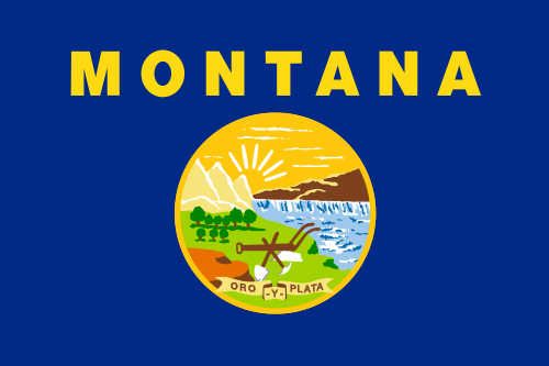


[Current flag]
Montana flag is still worse than Utah flag, in my opinion. Too many complicated details!

For my design, I used the colors of this proposed flag, that's too monochromatic, for me. Fusing this flag with the Eachel's proposal to Utah flag, I came with this design to Montana flag:


[My proposed flag]
Did it took a strange origin? You decides!

Comments are welcome!

Dec 9, 2012

Oregon

The flag of Oregon is unique in US: it's the only with a reverse different from the obverse. Actually, Alabama and Massachusetts also used flags like this, but only Oregonian flag remains. Let's look at both sides of the flag:


[Current flag obverse]


[Current flag reverse]
The design of obverse is poor. The obverse is a lot better, but not ravishing.

To choice my favorite, I consulted a poll conducted by NAVA (North American Vexillological Association) in 2009. If you look the report with finalist entries, probably many flags will attract you. My favorite (that finished in 3rd position) was design by Douglas Lynch, that also created the absolutely amazing Portland flag. See it:


[Proposed flag - Design by Douglas Lynch]
Green for the forests, yellow for desert or wheat, the white triangles being the snow-capped mountains that divides the two parts of the state.

And for you, what is the best design to Oregon? Please, leave a comment.

Dec 1, 2012

Alabama and Florida

Alabama and Florida are very similar: both contains a red saltire (St. Andrew's cross). Today I'll try to distinguish them but keep them simple.

Let's start with Alabama flag:


[Current flag]
The biggest sin in Alabama flag is, paradoxically, its simplicity: it's almost identical to St. Patrick's flag and maybe a dozen of other flags in the world.

The origin of Alabama flag is disputed. Some researchers says it resembles Confederate battle flag, but it possibly has the same origins of Florida flag: the Cross of Burgundy flag, a flag Spain used in colonial times. If the saltire came from Spanish heritage, my design adds blue to represent the French, British and American colors. It's here:


[My proposed flag]
The red tone make it a bit more contrasting. Now I'll come to Florida:


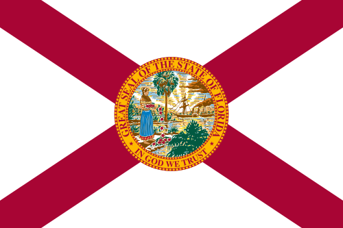
[Current flag]
Although it's distinguishable inside USA, the complicated seal doesn't make it a good design. My first design use the proper Cross of Burgundy, because "Latino" heritage is big in Florida, and a sun, representing the tropical wealth of the state.


[My proposed flag]
I liked this design, but after that I came with an improved design:


[My proposed flag]
Now the orange disc represents both the sun and the rich citrus culture of the state. And it someway resembles the state seal.

Comments are welcome. (You don't need a Blogger account to be able to comment).

Nov 23, 2012

Maine and Vermont

In the case of Vermont and Maine, I came with two similar flags, so I had to decide which of the flags should have the design.


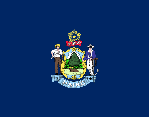
[Current flag]
The Maine flag is considered one of worst state flags in USA: it as a complex coat of arms, many writing and its blue field make it practically identical to many other state flags. I think a good flag could be the one used between 1901 and 1909.


[My proposed flag, based in historic flag]
The flag above is very similar to actual historic flag, but I moved the star to the right, representing Maine localization in the east of country. This flag is very good, but I know a better proposal, made by Jack Expo. Look at it:


[Proposed flag - Design by Jack Expo]
I think that by now the flag is alright. There's also the Maine naval ensign, but I'll explain in a next post the reason I won't choose it. So I come to next state, Vermont.


[Current flag]
The Vermont flag is very similar to Maine flag. Have you ever noticed this? Therefore Vermont flag is bad, too. And the proposed flags to Vermont are often similar to my favorite Maine flag. Many of them are based on the proposal by newvermontflag.com (this isn't their actual URL). I made some small changes to their flag:


[My proposed flag, based on design by newvemontflag.com]
But I see a big issue on it: it's very similar to the Maine flag. But there's always the flag of Green Mountain Boys, isn't there? The stars arrangement varies, but I use the one adopted by the movement Second Vermont Republic.


[Historic flag]
I think I'll keep with it, but, just for curiosity, look at one of my own designs, that could do a good government flag.


[My proposed flag]
This one has elements of two previous flags, and the white disc make it a good option even with the blue background.

What's your opinion about these flags? What should be Maine and Vermont flags? Your comment is very appreciated.

Nov 20, 2012

California, Indiana, South Dakota and Wyoming

Now it's time to some simplifications: good ideas that became ill by complexity of under-editing.


[Current flag]
This flag is based on California Republic 1st flag (a worst concept), on the other hand based on California Lone Star flag (very good, but maybe too generic). The current design is a good flag, the only problems are the writings and the excess of "fur". My proposal is this:


[My proposal flag]
The star and the bear are bigger, and maybe it's even better in clothing and pop art, where California flag is commonly seen.

The next is Indiana:


[Current flag - Original design by Paul Hadley]
Although having a dark blue background, as many state flags, its design make it still distinguishable. The big problem on it is the writing; it's easy to solve: just adopt the original Paul Hadley's design, without the word.


[Historic proposed flag - Design by Paul Hadley]

OK, so let's come to the next: South Dakota.


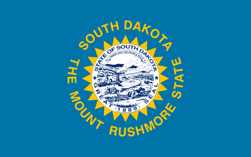
[Current flag]
The flag has many bad points: the state seal, the state name (if counts with the same, it's been written twice) and, even worse, a slogan. At least, it still resembles the better flag used between 1909 and 1992. But it still need to be simplified.


[My proposed flag]
I also increased sun size and changed the colors to better contrast. I must note that there's an official flag proposal, but I think it's good but inexpressive.


The last flag of the post is Wyoming:


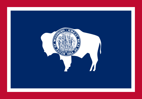
[Current flag - Design by Verna Keays and Grace Raymond Hebard]
The design is distinguishable, I'll only remove the seal and increase the size of the bison.


[Proposed flag - Common design]
With this, we end the post.

Your comment is welcome. Please, leave yours!

Note: the bear silhouette was kept in Deposit Photos. It's currently copyrighted.

Nov 19, 2012

Hawaii

Now it's time of Hawaii flag to be analyzed.


[Current flag]
I'm sure it's a great flag. Its design is highly recognizable, but still simple. But it carries a great issue: the Union Jack, i.e., the flag of a sovereign country other than USA, moreover in a prominent position.

My proposal is inspired in Hawaii governor flag, that, except for its writing, is a great flag. I altered the number of stars to nine, to match the number of stripes, that has the same symbolism: the number of main islands in Hawaiian archipelago. It's the result:


[My proposed flag]
Now it looks more like an American flag than a British ensign, but I know Hawaiians will never forget their historic relationship with British crown.

Or, if prefer, the same eight-stars arrangement from governor's flag:


[My proposed flag]
By the way, I'm inviting you to know the proposals I made to each one of Hawaiian main islands.

Your comment is welcome! Please, don't forget to follow blog progress.

Nov 18, 2012

Georgia and Mississippi

The Southern people have the loving for the Confederate flags, because it represents perfectly the Southern heritage. But the Northern people often see them as racists symbols (by the historic relationship between Confederacy and slavery). Let's try to make nobody unhappy!

Firstly, see the current Georgia flag:


[Current flag]
It's basically the Confederate "first national flag" with Georgia state seal on center. It's not good, but a lot better than horrible previous flag. First problem: it contains a Confederate flag, although this one doesn't carry the same hatred. Second problem: The seal is too complicated to be placed in a flag, and almost impossible of being sewn. My proposal is the flag Georgia used between 1879 and 1902, that remembers the current flag at all.


[Historic flag (1879-1902)]
A lot better, isn't it? Now, I'll try to fix the next flag with a Confederate flag: Mississippi.


[Current flag]
The Confederate battle flag is a different case: their connotations in some parts of US aren't the better, and some people feel seriously offended by it. Moreover, the white fimbriation between the canton and the stripes shows that something is going wrong.

Luckily, I won't need to create a new flag: there's a good unofficial flag, dating from 2000 (little before 2001 Mississippi flag referendum):


[Historic proposed flag]
It doesn't seems Confederate at first sight, but it represents the Southern heritage. It doesn't fit the US national flag (red stripes, blue canton), but it's also represented.

Comments are welcome!